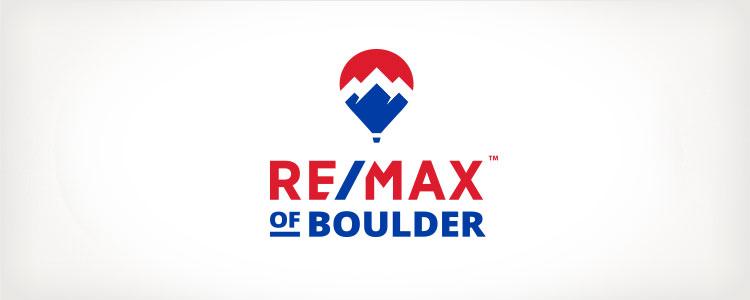
We originally rebranded RE/MAX of Boulder in 2012 and have continued to work with the company on various projects ever since. So, when RoB approached us recently to update their logo and brand once again, we were happy to take on the challenge.
The Evolution of a Brand
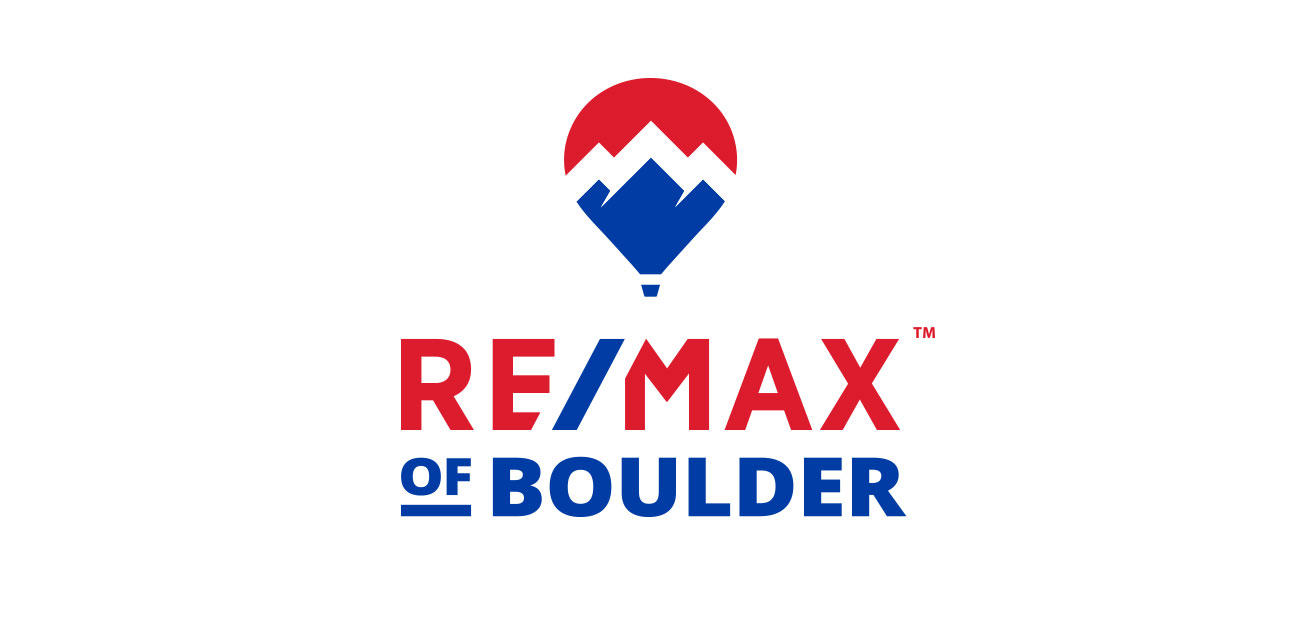
A signature feature of DD9’s original design in 2012 was the abstracted mountain graphic, which recalls a set of peaks here in Boulder called The Flatirons. When redesigning the logo again in 2017, our goals were to:
- Preserve some connection to the mountain graphic in the original logo
- More closely match the updated RE/MAX corporate logotype and balloon
Our final solution combines typography from the updated corporate brand with a new icon that incorporates both balloon and mountains in one graphic. The final result is a logo that underscores RE/MAX of Boulder’s location-based identity, while remaining closely tied to the parent brand.
![]()
![]()