Many clients ask about creating a mobile version of their new website or website redesign. In the past, this process often involved creating two versions of the site and then using some “sniffer” code to redirect mobile users to the mobile-specific version. More recently, though, there has been a movement towards designing for “one web,” meaning that the content and design of a site need not vary so drastically from device to device. For non-coders or those just getting familiar with the concepts of responsive web design, the premise of responsive design and how it operates may be unclear.
To elucidate, responsive web design is the practice of devising a single design that is adaptable to its viewport, instead of creating multiple designs specific to every possible web-viewing device. In other words, the designer creates one design whose structure varies depending on the screen, but whose primary design elements and content stay largely the same.
The main strategies that web designers use to implement this technique involve:
- percentage-based layouts and images
- CSS media queries
Flexible Content
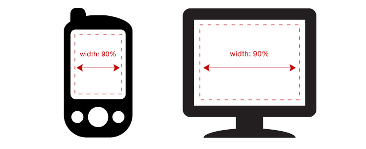
The first method involves using flexible layouts that are based on percentages, rather than fixed pixel dimensions. This means that instead of having a content area that is 960px wide even if the screen width is only 320px (like on an iPhone), the designer would set the content area to have a width of 90%. That way, the content would always take up 90% of the screen, no matter what the exact dimensions of that screen might be.
The same theory also applies to images, although there are a few additional concerns when dealing with images, such as performance issues that can occur when serving up desktop-resolution images to mobile browsers.
CSS3 Media Queries
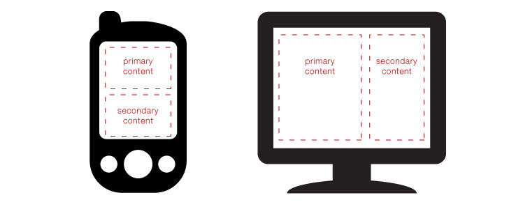
The second method employs CSS3 media queries to detect whether a screen is a certain pixel width or lower and then activate different CSS styles accordingly. This enables the designer to add unique styles for different size displays, without needing to know the exact dimensions of the device. For example, on a desktop display, the primary and secondary content areas may look best floated next to one another; when viewed on a smaller display, however, it may may make more sense to have the primary and secondary content areas each take up the full width of the screen and be stacked one above the other. The designer can use CSS3 media queries to specify whether the elements on the page are arranged according to one layout or another, based on whether the screen is a certain size or lower.
The combination of the two methods above is a popular, successful approach to designing websites that will look great on any device, without the need to create completely disparate mobile and desktop designs.


