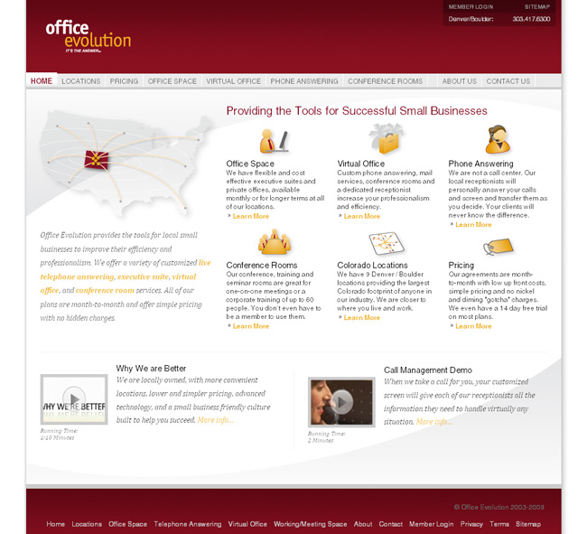
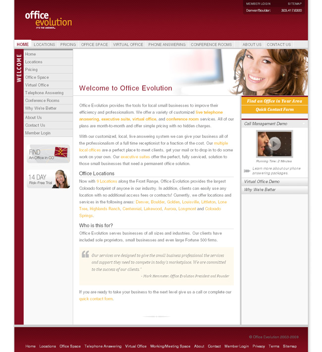
After three months of monitoring the OfficeEvolution website traffic and user behaviors, we decided to redesign their landing page to reduce the bounce rate. The new layout features a set of six custom service icons, a new service map graphic, and a restructured code formatting for SEO improvements.


Hi, nice posts there 🙂 thank’s for the interesting information
Very nice. I actually got a very professional vibe from both this design and the other. I do think the white background looks great! keep it up.
I like the color scheme here. Not many would think these colors would blend this well together and they really do!
Not bad… i like the a idea of quality landing page design .
Um, I designed that service map graphic.
Was that you? It is a great graphic. I had to recreate it from the design on OE V5, and I matched it almost exactly.
Actually, I think I end up working with a lot of your designs for OE pricing collateral and such. Great work!